Part 1 – How to Build a Pinterest-Style Layout in SwiftUI Using the Layout Protocol
Introduction: Why Custom Layouts in SwiftUI Matter
When Apple introduced the Layout protocol in SwiftUI, it unlocked a powerful way to build standard and custom layouts with more control and flexibility. This new approach makes it easier to create complex behaviors that go beyond what the built-in stacks and grids can do.
This blog will explore the Layout protocol for building a custom layout inspired by the Pinterest app and explain the fundamentals of creating custom structures in SwiftUI.
Benefits:
- Complete control over layout behavior without relying on hacks
- Enables advanced, reusable layout patterns
Limitations:
- Available only on iOS 16.0+
Getting Started
To get started, download the project materials by cloning the repository.
git clone https://github.com/belkhadir/PinterestStyleLayout --branch started
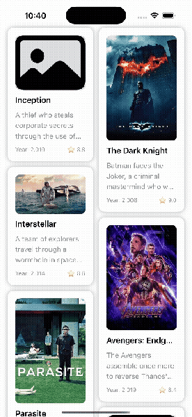
Open the starter project in Xcode, build, and run it:
Understanding the Layout Protocol
The Layout protocol gives you fine-grained control over how views are sized and positioned, without needing workarounds like GeometryReader, which can introduce layout instability or crashes in complex scenarios.
Conforming to this protocol allows you to create clean, modular, and reusable layout components tailored to your app’s needs, such as Pinterest-style masonry grids or other adaptive column systems.
If you haven’t already, I highly recommend watching Compose Custom Layouts with SwiftUI from WWDC22. It offers valuable context and examples that complement this topic.
Key Methods: sizeThatFits & placeSubviews
To build custom layouts in SwiftUI, it’s essential to understand how the layout system works under the hood. The process generally involves three steps:
- Measure each subview’s ideal size by proposing an unconstrained size (.unspecified or nil x nil).
- Compute the positions of all subviews based on the container’s available size.
- Place each subview according to the positions calculated in Step 2.
SwiftUI provides two core methods for this:
- sizeThatFits(proposal:subviews:cache:) Calculates and returns the overall size the composite layout needs to fit its subviews.
- placeSubviews(in:proposal:subviews:cache:) Assign the exact positions and sizes for each subview within the container.
Calculating Card Width and Spacing
We need to understand how to calculate the total available space width. Here’s a visual guide:
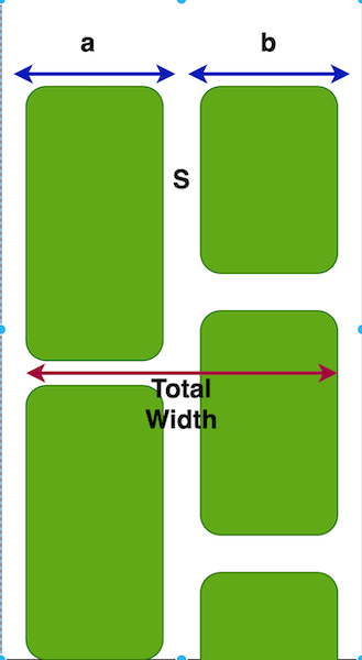
Since the card widths will be equal, we can revise the formula:
let proposedWidth = proposal.replacingUnspecifiedDimensions().width
let cardWidth = (proposedWidth - itemSpacing) / CGFloat(numberOfColumns)
Explanation:
aandbare the widths of the cards.Srepresents the spacing between cards.- The
proposedWidthcomes from SwiftUI’s layout system when it asks your layout how much space it needs. - You subtract the spacing first, then divide evenly to get each card’s width.
You can enhance the formula with labeled variables like:
Card Width = (Proposed Width - Total Spacing) / Number of Columns Total Width = (Number of columns × Card Width) + Total Spacing
Dynamic Height Calculation
Calculating the height is tricky because each card has a dynamic height; unlike the width (which we calculate once), the height depends on how the cards are stacked vertically.
We need to report the total height required, as we did for the width, but this time it's different.
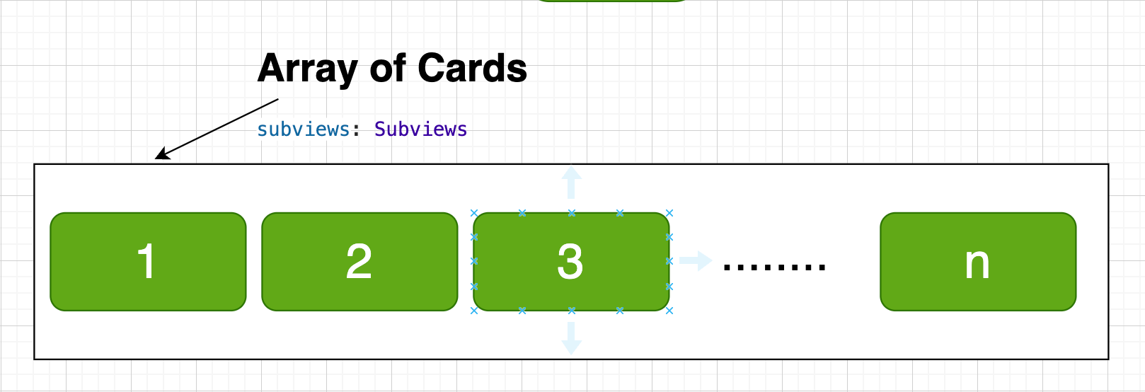
SwiftUI’s sizeThatFits method provides an array of subviews, each representing a card. From this array, we can extract the intrinsic height:
To simplify things at this stage, we’ll assume a fixed number of two columns. Later, we’ll generalize the layout to handle any number of columns. As a result, we obtained:
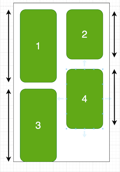
We can see that the left column is taller than the right one.
To determine the final layout height, we take the maximum total height between both columns:
Left Column Height = cardHeight1 + cardHeight3 Right Column Height = cardHeight2 + cardHeight4 Total Height = max(Left Column Height, Right Column Height)
Breakdown of the sizeThatFits Logic
To calculate the total height of our Pinterest-style layout, we split the views into two columns, left and right, and sum up the heights of each. The final layout height is the maximum of the two.
var leftSizeColumns: [CGFloat] = []
var righSizeColumns: [CGFloat] = []

for (index, subView) in subviews.enumerated() {
    let height = subView.sizeThatFits(.init(width: cardWidth, height: nil)).height
    if isNewLine(index: index) {
        righSizeColumns.append(height)
    } else {
        leftSizeColumns.append(height)
    }
}
Here’s what’s happening:
- Given the fixed card width, we loop through each subview to calculate its ideal height.
- We then assign it to either the left or right column:
- If index % numberOfColumns == numberOfColumns - 1, it’s added to the right column.
- Otherwise, it’s placed in the left column.
func isNewLine(index: Int) -> Bool {
    (index % Self.numberOfColumns) == (Self.numberOfColumns - 1)
}
- We sum all the individual heights and add vertical spacing between the cards.
- Then, we compute the final layout height as:
let totalHeight = max(
    totalHeight(for: leftSizeColumns),
    totalHeight(for: righSizeColumns)
)
The sizeThatFits implementation of the protocols will look like this :
func sizeThatFits(proposal: ProposedViewSize, subviews: Subviews, cache: inout ()) -> CGSize {
    let safeProposalWidth = proposal.replacingUnspecifiedDimensions().width
    let cardWidth = (safeProposalWidth - itemSpacing) / CGFloat(Self.numberOfColumns)

    var leftSizeColumns: [CGFloat] = []
    var righSizeColumns: [CGFloat] = []

    for (index, subView) in subviews.enumerated() {
        let height = subView.sizeThatFits(.init(width: cardWidth, height: nil)).height
        if isNewLine(index: index) {
            righSizeColumns.append(height)
        } else {
            leftSizeColumns.append(height)
        }
    }

    let totalHeight = max(
        totalHeight(for: leftSizeColumns),
        totalHeight(for: righSizeColumns)
    )

    return CGSize(
        width: cardWidth * CGFloat(Self.numberOfColumns) + itemSpacing,
        height: totalHeight + itemSpacing
    )
}
After calculating the total size required using sizeThatFits, the next step is to position each subview on screen using the placeSubviews(in:bounds:proposal:) method.
Like before, we split the subviews into two groups, left and right columns, and now we will place them separately. Let’s start with the left column placement:
var x = bounds.minX
var y = bounds.minY + itemSpacing

for leftSubview in leftSizeColumns {
    let height = leftSubview.sizeThatFits(.init(width: cardWidth, height: nil)).height
    leftSubview.place(
        at: CGPoint(x: x, y: y),
        proposal: ProposedViewSize(
            width: cardWidth,
            height: height
        )
    )

    y += itemSpacing + height
}
What’s Going On Here?
- x and y define the current position of the subview inside the layout’s bounds.
- We start from the top left (minX, minY) and leave some initial vertical space (itemSpacing).
- For each subview:
- We calculate its height.
- We place it at the current position using
place(at:proposal). - Then we calculate the y position by the height plus some vertical spacing, so the next subview appears below the current one.
Challenge: Your Turn Placing the Right Column
Now that you’ve placed views in the left column, applying the same logic to the right should feel familiar. Try completing the placeSubviews function to position the right-side cards using the same approach.
You can find the unfinished code in the challenge repository.
Hint
1) Start from the right side (x should account for card width + spacing).2) Use the right column array.
3) Place each view at the correct
x, y coordinate.4) Increment
y just like you did for the left column.What’s Next: Evolving Your Custom Pinterest Layout
You’ve just built the foundation of a custom Pinterest-style layout using SwiftUI’s powerful Layout protocol. This first version supports two columns with basic spacing logic, laying the groundwork for more flexible and performant UI designs.
You can check out the complete working implementation here: GitHub
Up Next: Smarter, More Dynamic Layouts
In the next installment, we’ll take your layout to the next level by introducing:
- Let users define any number of columns dynamically (not just two).
- Move beyond the modulo approach to balance column heights intelligently, just like the real Pinterest layout.
These improvements will help your layout adapt to different screen sizes, maintain aesthetic balance, and become production-ready.
References & Resources
Here are some valuable resources that helped guide the design and implementation: